


I have spent a lot of time building this application, but somewhere along the way I realized I was building more than software.
I was building a place for stories.
The technology matters. The database matters. The architecture matters. The pages have to load, the links have to work, the publishing system has to be reliable, and the application has to be able to grow.
But none of those things are the reason I kept working on it.
The reason is much simpler.
I wanted a place where people, ideas, photographs, experiences, and stories could remain connected.
That idea is becoming the foundation of the new Wildwood.
The application has grown from a collection of pages into a real publishing platform with distinct systems for short posts, long-form stories, articles, photography, contributors, search, discovery, and personal profiles.
Behind it is the stack I have continued to work with and refine: ASP.NET Web Pages and Razor, SQL Server, stored procedures, structured content, media, tags, authentication, analytics, and the small details that make a site feel coherent instead of assembled.
But the biggest change is not technical.
It is the identity.
The new branding is intentionally quieter and more personal.
Less about filling a screen.
More about creating meaning.
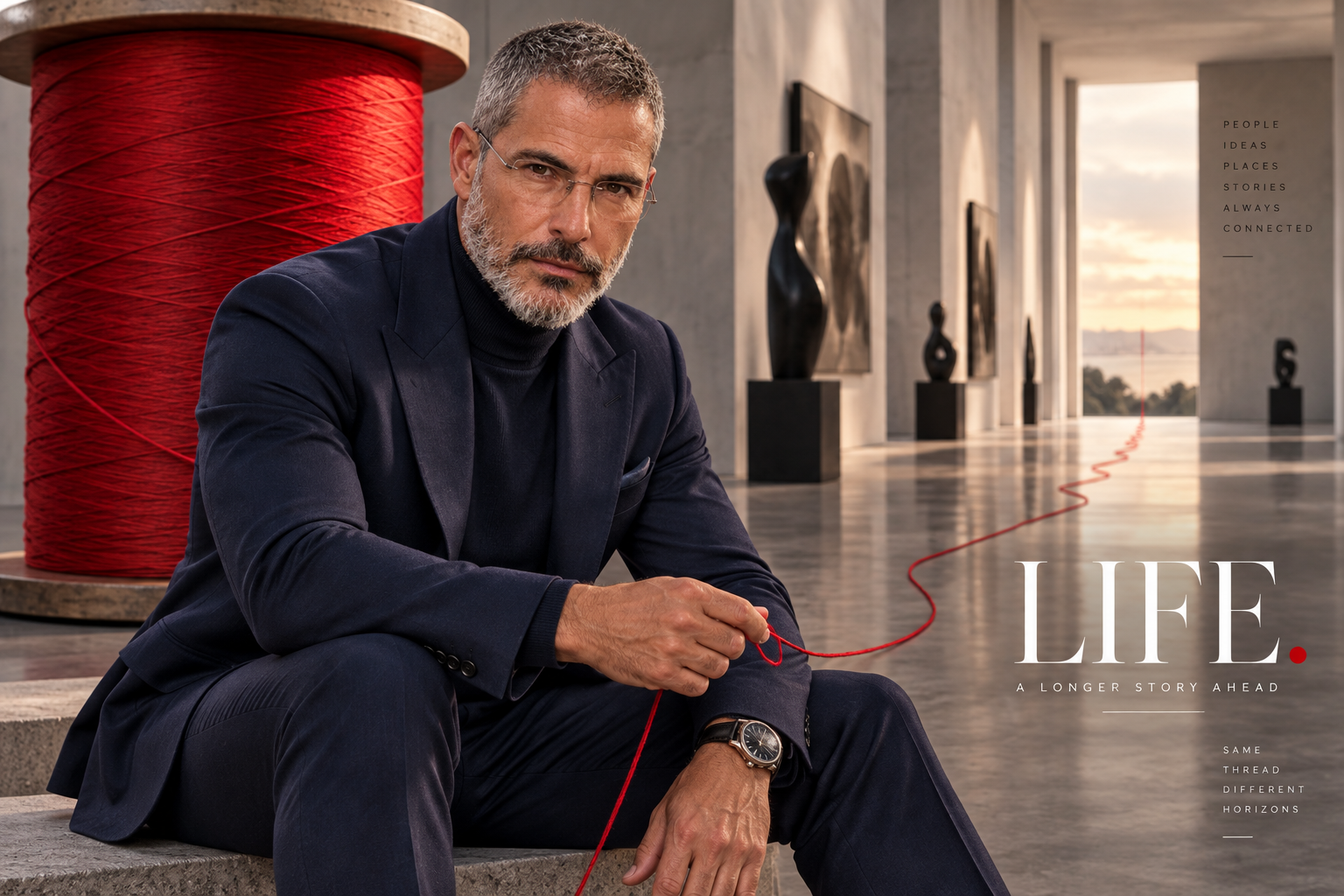
The red thread has become an important visual idea for me.
A thread can connect people who may never stand in the same room.
It can connect one chapter of a life to another.
It can travel through grief, recovery, love, work, failure, rebuilding, and whatever comes next.
Sometimes the thread is obvious.
Sometimes you only recognize it when you look backward.
That is what this image represents to me.
LIFE.
A longer story ahead.
People.
Ideas.
Places.
Stories.
Always connected.
Same thread.
Different horizons.
There is also something personal in building this now.
I have lived through enough change to understand that a life cannot always be organized into clean chapters.
Some stories overlap.
Some are interrupted.
Some have to be rebuilt.
Some change direction completely.
The application reflects that.
A short post can become part of a larger story.
A photograph can carry a memory that words cannot.
A personal experience can become an article that helps someone else understand something they are facing.
A difficult chapter can sit beside a hopeful one without either becoming less true.
That is the kind of publishing platform I wanted to create.
Not something built around constant noise.
Something built around continuity.
The redesign has also forced me to simplify.
I have removed things that did not belong.
Reduced visual clutter.
Separated Posts, Stories, and Articles into distinct content systems.
Reworked discovery.
Rebuilt the homepage.
Reworked the For You experience.
Added long-form publishing.
Improved how media and contributors are presented.
Moved more of the application toward stored procedures and clearer database contracts.
And slowly, the site has started to feel like one thing instead of many disconnected experiments.
That matters to me.
Because branding should not simply be a logo placed above an application.
The application itself should express the brand.
The typography.
The whitespace.
The photography.
The editorial hierarchy.
The way stories are discovered.
The way a person moves from a photograph to a post, from a post to a story, and from a story to something deeper.
They should all feel connected.
Like a thread.
I chose the word LIFE because it is broad enough to hold everything I want this project to become.
Not only technology.
Not only trees.
Not only photography.
Not only personal stories.
Life includes all of them.
The good parts.
The difficult parts.
The ordinary parts that turn out to matter more than we realized.
The people we meet.
The people we lose.
The things we build.
The things we have to rebuild.
The places that become part of us.
The ideas that stay with us.
And the stories we leave behind.
This application is still evolving.
There are features I want to improve.
There are pages I will probably rebuild again.
There are parts of the database that will continue to mature.
There are stories that have not been written yet.
That no longer feels like unfinished work to me.
It feels like the point.
The platform should continue changing because life continues changing.
So the new branding is not intended to say that the project is finished.
It says almost the opposite.
LIFE.
A longer story ahead.
That is the statement.
And it may be the clearest description yet of what I have been building.